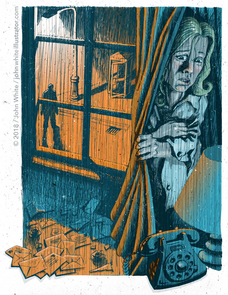
An illustration for an unnerving and true Sunday Independent Newspaper story about a family stalker, written by Ruth Dudley Edwards.
Haunted, hounded by a family ghost: “I retain a vivid image of looking out my study window one night to check the weather, and suddenly seeing (him) gazing at me from underneath a streetlight, with the sleet falling gently on his upturned, handsome, bitter face.”
Case Study
Background
This was a frightening story, but one which Ruth told somewhat light-heartedly. The victims exhibited feelings of genuine fear, but tried to put a brave face on it, and to even laugh it off as a way of basically not cracking under the stress. They’d refer to their stalker as ‘their ghost’. To me, and probably to Ruth, it really was no laughing matter. So I made it as menacing and scary as I could. ‘Concerned about the effect on the children, we made as light of it as we could, and even christened him the family ghost.’
Technique/Approach/Medium
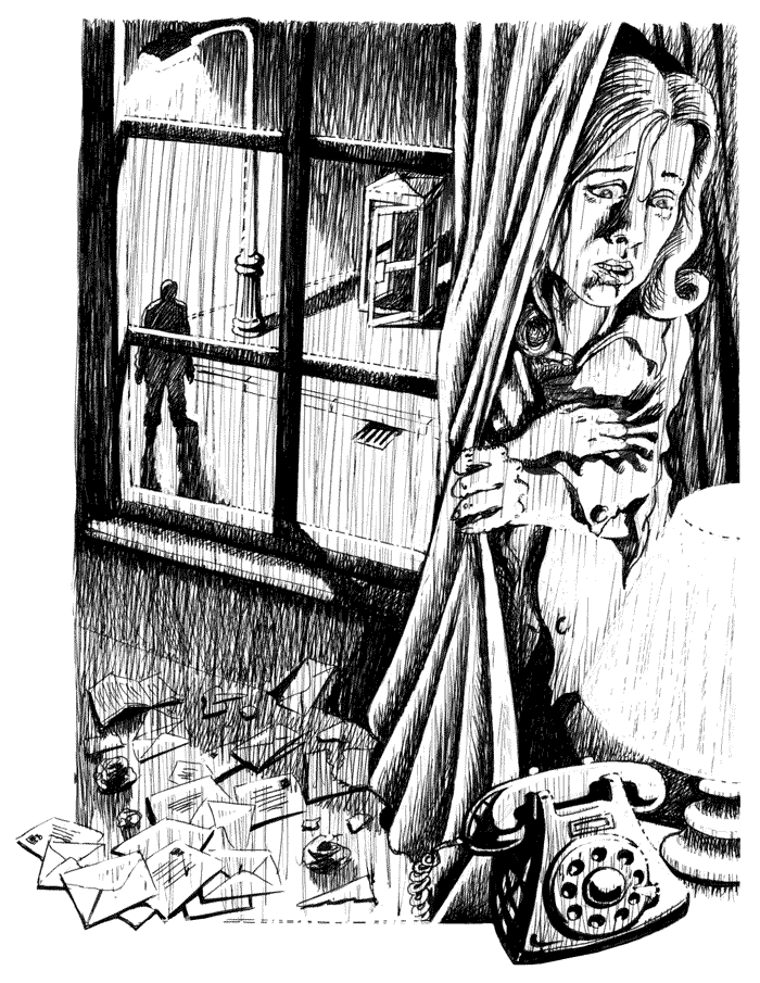
I wanted a stark, fairly high contrast look with silhouettes and shadows. So I left the watercolours aside and used only black ink. I used a hatched approach for the tonal values—which I knew would print perfectly, even in a newspaper. I also started the whole thing off by rapidly slashing vertical lines to establish a starting mid-tone, but I also knew that it’d add to the sense of dread and creepy atmosphere. As I sometimes did when life-drawing in art college, I started to work into this with the pen, but also cut white into it with white ink.
I used a similar effect on this frightening and disturbing illustration about Post-traumatic stress disorder amongst soldiers.
Positive-Negative
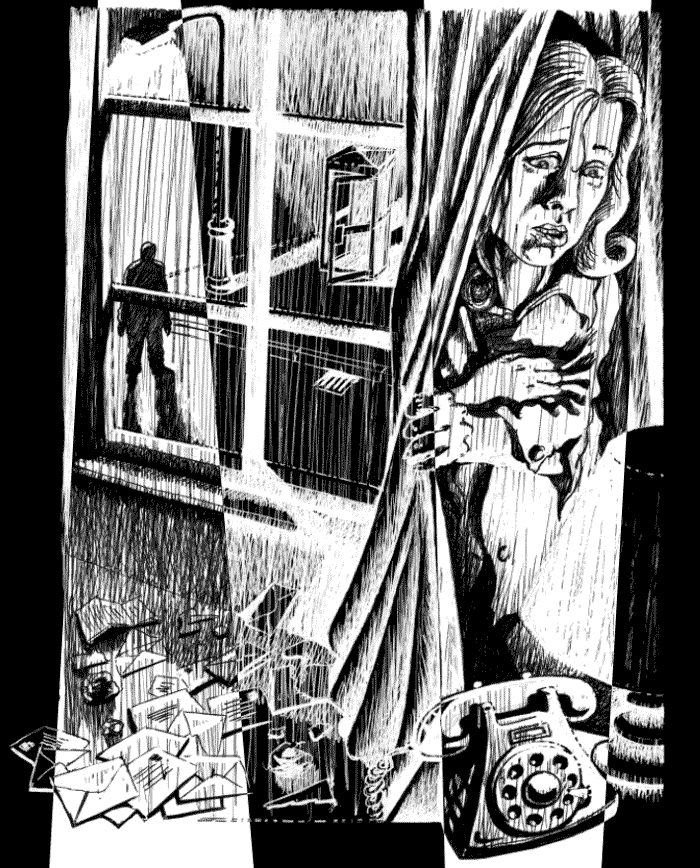
I’ve made another version of the black and white image here, using positive and negative bands. It’s like an effect which I saw in Quasimodo’s Monster Magazine, back in the 1970s, when they did features on some old Edgar Allan Poe move adaptations. They took high contrast black and white images based on the films and did this to them. Very striking and nightmarish!
Illustrator: John White
Media: Ink on paper
Colourisation: Photoshop
Client: The Sunday Independent Newspaper
Writer: Ruth Dudley Edwards