
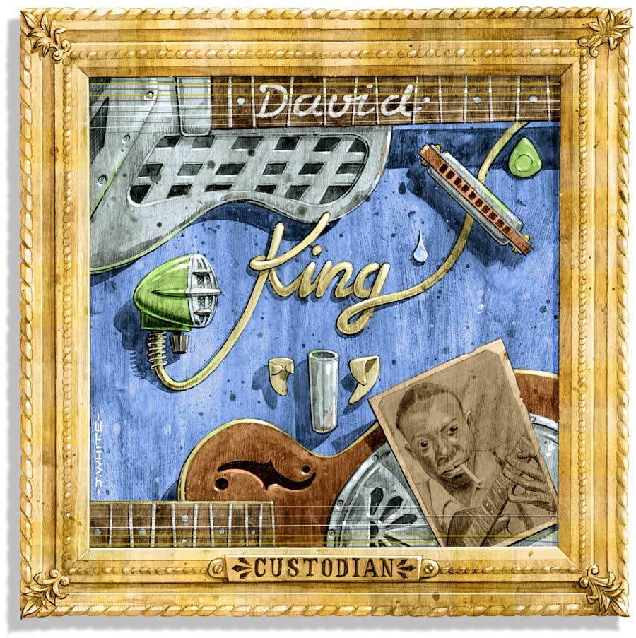
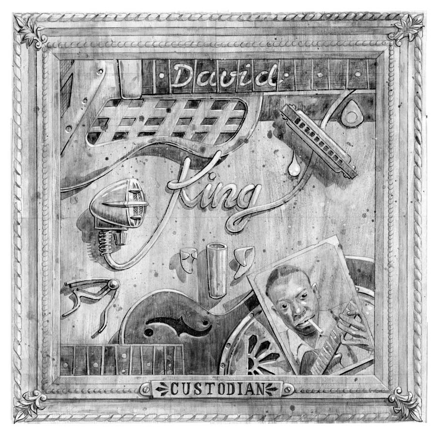
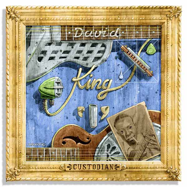
Album cover artwork for the ‘Custodian’ album by Irish Singer and Musician David King. Watercolour, pencil and ink, on board, digitally coloured.

Background
David liked the Robert Johnson painting which I’d done over 20 years ago, and approached me to do the artwork for his new album. He felt confident that I was the right man for the job, not just because of my artwork, but because of my own long experience (in a previous life) as a blues musician.


Concept
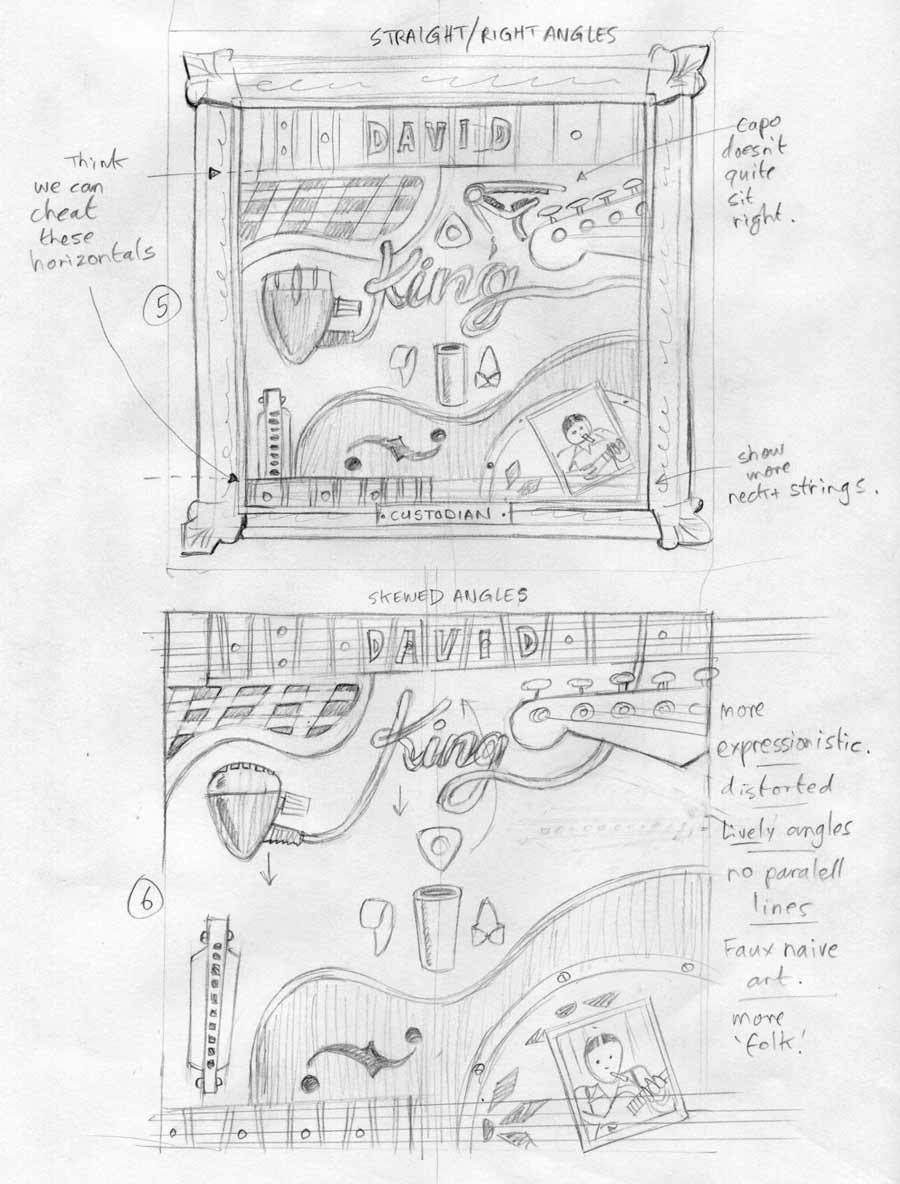
The original concept was really all David’s, in the sense that he said that he had a at one point considered placing some of his musical bits and pieces into a picture frame and photographing it. He explained that he doesn’t see himself as being a custodian of the Blues or owning it in any way, but that the blues was the custodian of his and other blues musicians’ music. He compared it to walking around an art gallery and seeing pictures on the walls and that the galley was the custodian of the art.
This album was also going to be more bluesy, with many of his solo performances on it, using a variety of guitars including Dobro-style and National steel resonator guitars.
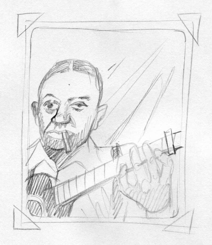
David also requested that legendary Bluesman Robert Johnson be included in some way. I was initially a bit concerned that ghosting Johnson into the backgrounds, or silhouetting him in some way might not look to good and confuse the composition—which might be in effect, a collection of objects.
Approach
Initial rough sketches
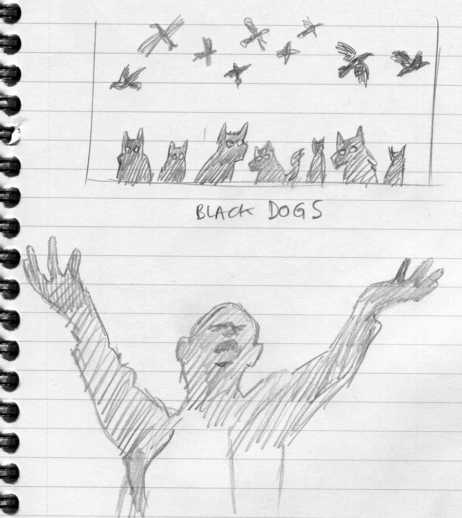
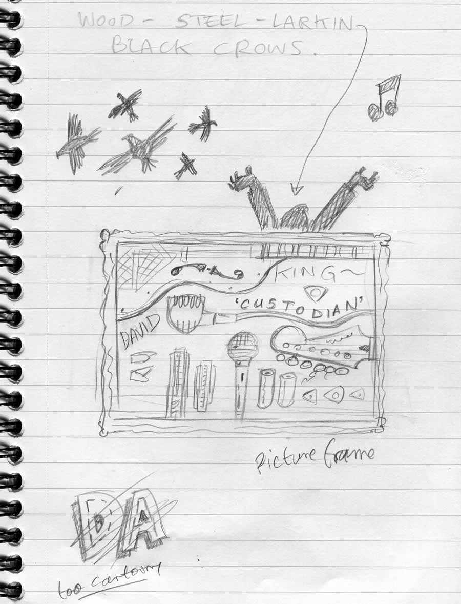
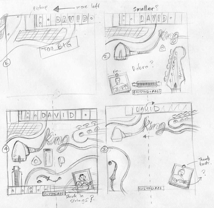
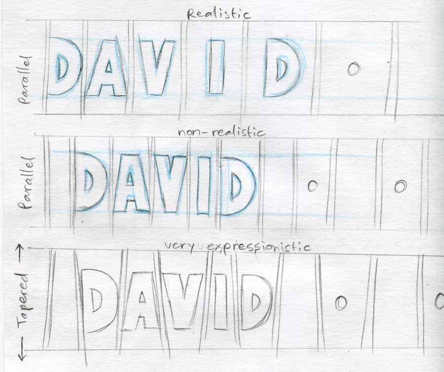
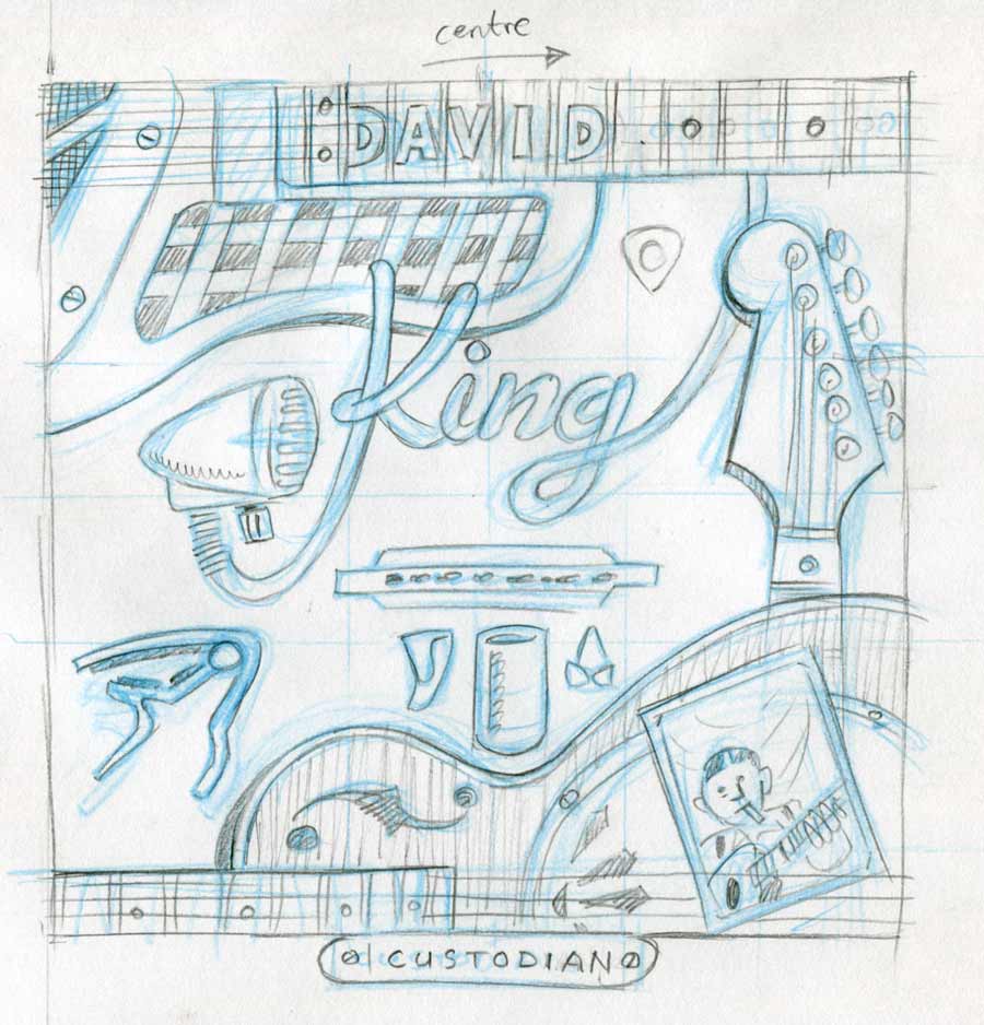
I listened to the album many times and sketched some concepts. I presented them to David, with the strongest ones basically using the picture frame approach. He was happy enough to give the go-ahead for more refined sketches based on that picture framed approach. Once that was approved I started pencilling the composition full size on the final board, larger than LP sleeve size (just in case) at 14 or 15″ square inches. 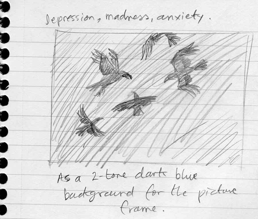
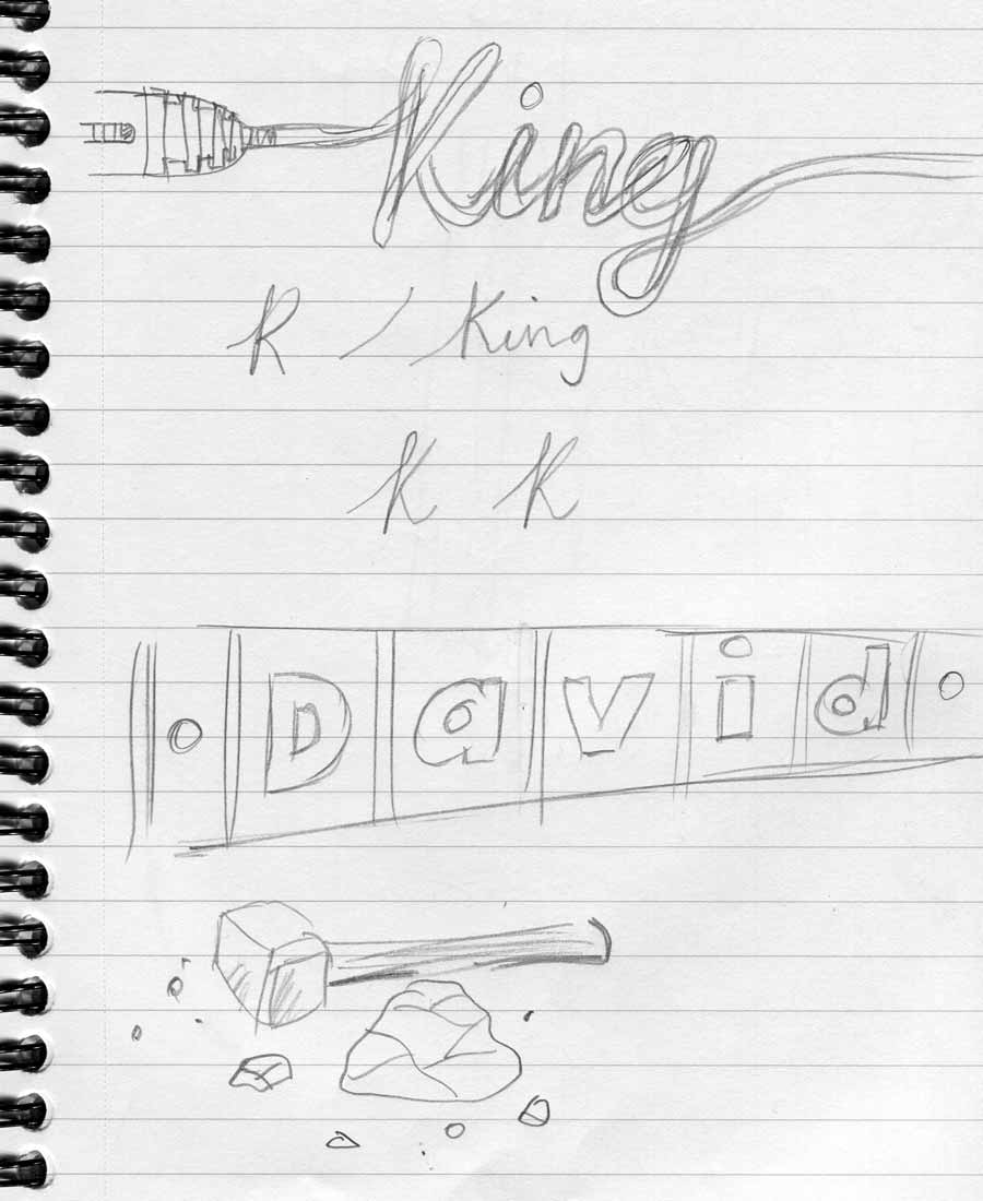

Sketched Visuals/Working out the Composition
I arrived at the idea of including Robert Johnson as another object: a sepia-toned photographic print. This way, he was consistent with the overall concept. It was a nice touch to slip him between the guitar strings.
Full-Size Art Stage
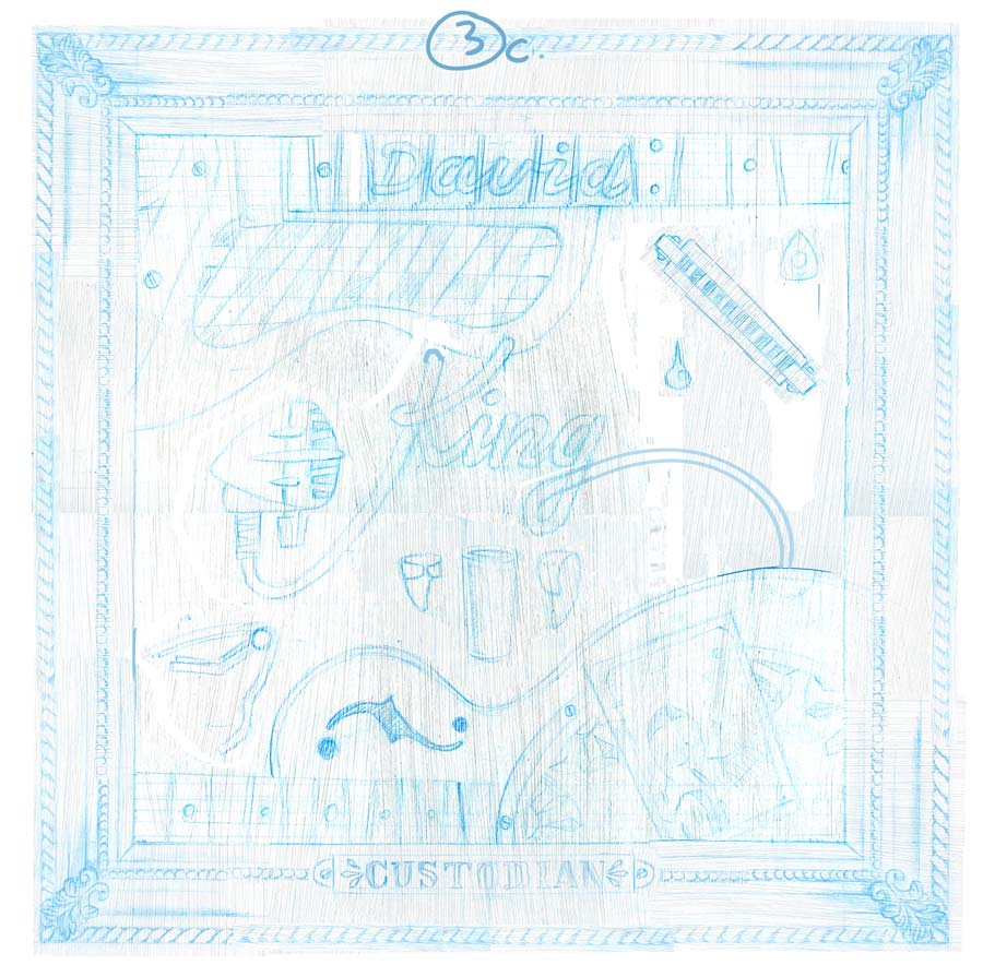
As I went along through the process I made more space around the objects, and then when at the computer colouring stage, suggested to David that we remove some elements to simplify the arrangement and composition. The Stratocaster guitar and the capo were removed, and the harmonica moved top-right freeing more space in the middle.
The Result
David’s delighted with the finished piece, as am I, and he would love to do also a 12″ LP release.
Bonus Art!
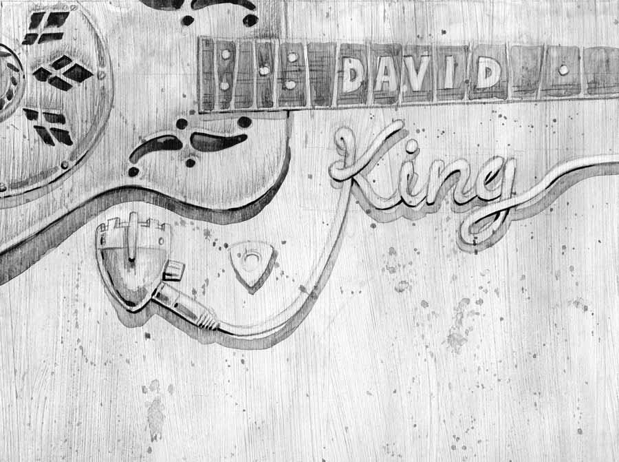
This was a quick tester piece to see how I might handle the artwork and colouring.
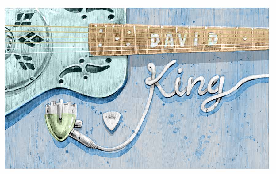
Illustrator: John White
Painting: Goauche, ink, pencil, on board
Colouring: Photoshop

fantastic work John
Thanks Jacqueline.
I enjoyed the heck out of it! Lovely clients too 😉