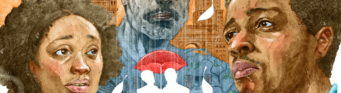
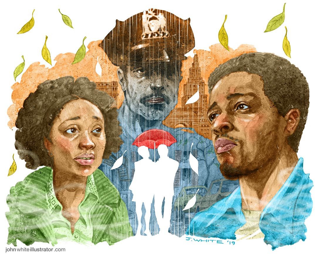
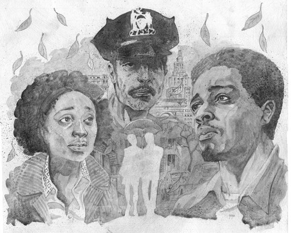
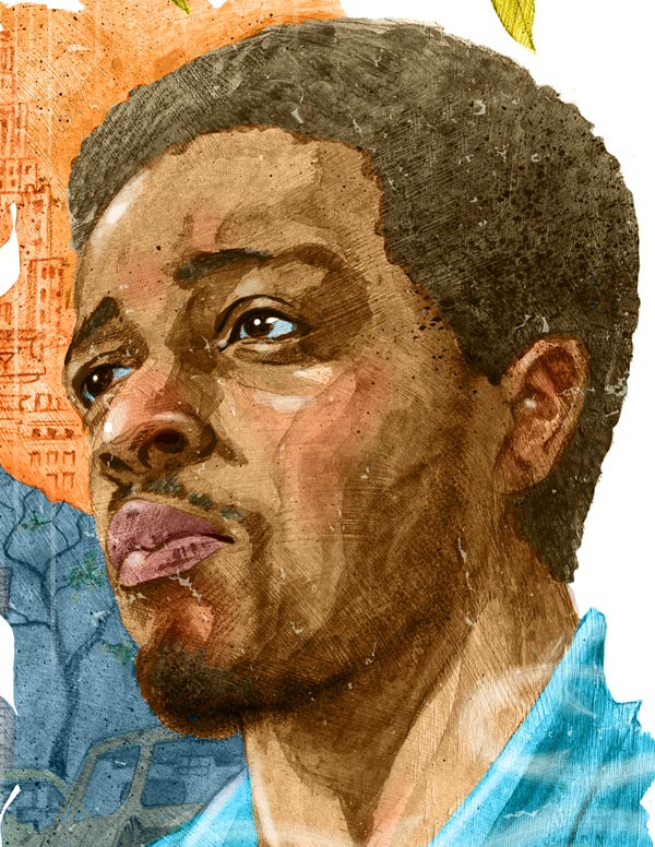
The Lead movie review illustration for Totally Dublin magazine, Feb 2019; for ‘If Beale Street Could Talk,’ by Barry Jenkins, and based on the acclaimed novel by James Baldwin
Case Study
I loved the 1970s aesthetic. So I had that, and painted movie posters of the 70s in mind when I conceived and artworked this.
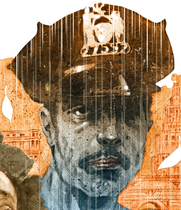
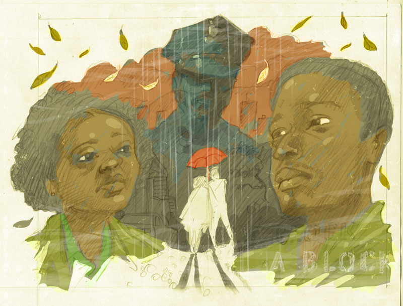
The first thing I thought of when the film finished was the fact that the cop character—who barely appeared in the film—has a catastrophic effect on the lives of so many of the film’s characters. I wanted to show him between the 2 lovers, and in the background as a sort of haunting menace, watching them, without emotion or sympathy. In a way, it’s a different take on the film. Most of the marketing campaign’s still imagery is romantic and sweet. It’s only when you see the trailers that you get a sense of lurking darkness and tragedy. I wonder if the filmmaker’s message was re-jigged by the marketing people and the studio, in order to sell the movie to a female audience? Hmmm… Valentines day is coming up soon!
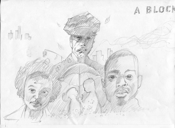
I had thought that it’d be cool to include the ‘A BLOCK’ stencil type for added visual interest and texture, but I couldn’t think of any other type to include with it—except maybe for ‘Greenwhich Village’. I felt that it couldn’t just have ‘A BLOCK’ in it, as it’d be a bit incongruous alone, and might even look like it was the actual title of the film! So I dropped the idea.
I also didn’t go with the close-up side-profile of the couple under the umbrella as it was too much like the official poster. Instead, I showed them small, beneath the dark menacing spectre of the NYPD cop. And instead of repeating the romantic leads, and adding more detail, I ‘ghosted’ them in white, bleeding out into the white page. In one way, they appear as the bright light of love in the centre of all of the strife, but in another way it feels like a faded ghost-remnant of the happiness they’d shared.
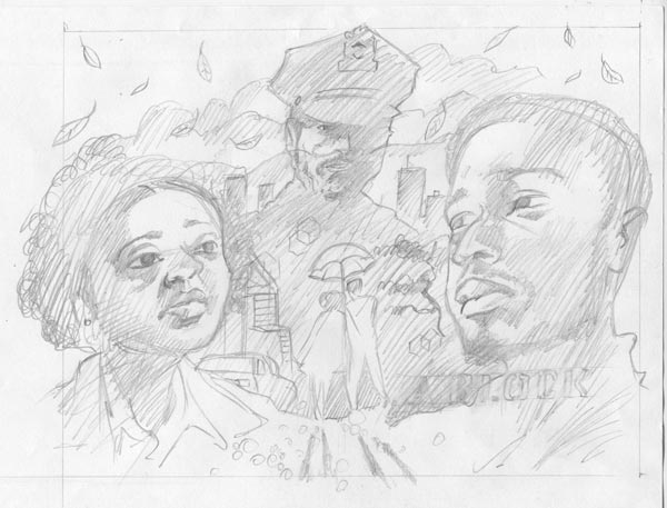
Of course, the rain is falling down on them, and it’s linked with the dark, cool coloured cop and street.
“Into each life, some rain must fall.
But too much is falling in mine.”
I painted the image onto a large primed board and finished it digitally in Photoshop. To be honest, I made it way larger than it needed to be—it’s over A3 size! But I’m happy that I can now put it up on my wall.
I really enjoyed this short project, and I spent my time working on it listening to nothing else but the film’s soundtrack album and it really got inside me. The film lingers within you long after the viewing. The lovely music score by Nicholas Britell occasionally even seems to recall some of the avant-garde music of the time in 1970s New York, with brief hints of Philip Glass and Steve Reich who were just beginning to make their mark. It’s a very haunting and beautiful film, which deserves the accolades that it’s receiving.
My thanks to the lovely folks at Totally Dublin for the commission, who were so nice to work with.
Client: Totally Dublin magazine
Illustrator: John White
Painting: Goauche, pencil, on board
Colouring: Photoshop