
I was delighted when composer and pianist, Kieran Morley commissioned me to create the artwork for his first music EP release of original compositions.
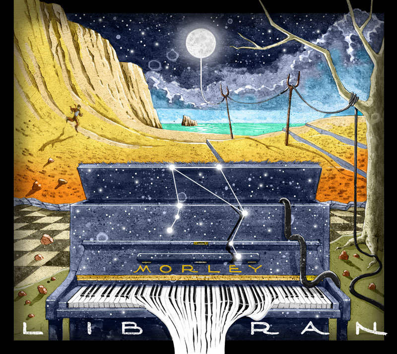
Case Study
Client Kieran, described his music as emotive, atmospheric and full of imagery, and he always hopes that it creates imagery in the audience’s mind; though he’s very open to their own interpretations of it. He also said that he would love an element of surrealism—liking the stream of consciousness idea; but he was completely open to my own ideas. Kieran proved this to be very much the case. He’s a dream client to work with.
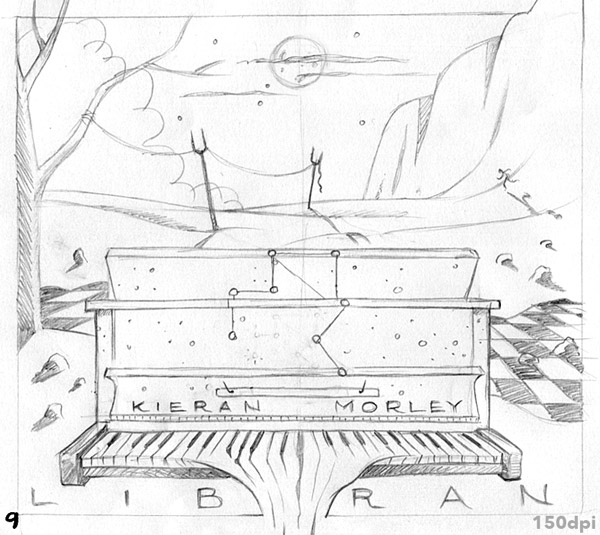
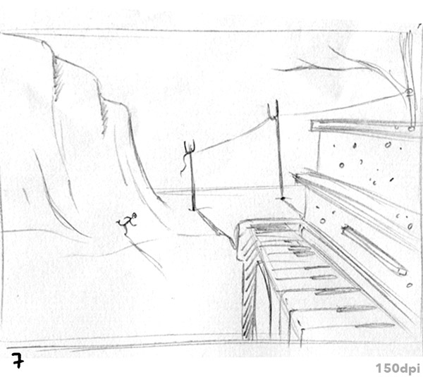
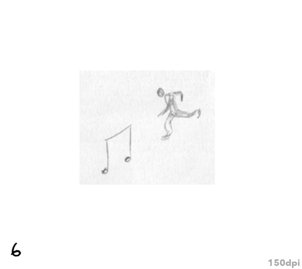
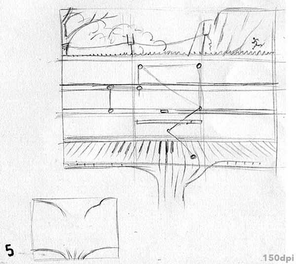
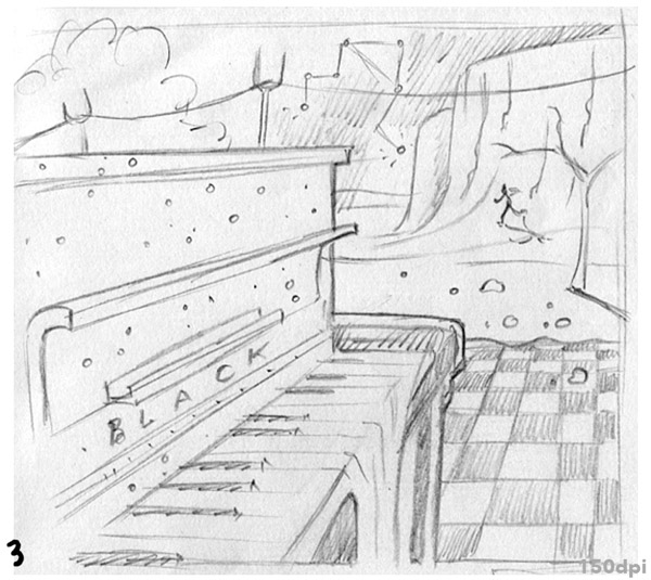
I mentioned the film ‘Spellbound’ by Hitchcock, for which Salvador Dali designed the dream sequences, and that gave me the running man; and I composed around many of Dali’s and the surrealist’s ideas. I think it’ll be fun for fans of Kieran’s music—and fans of surrealism—to spot the many little relevant elements.
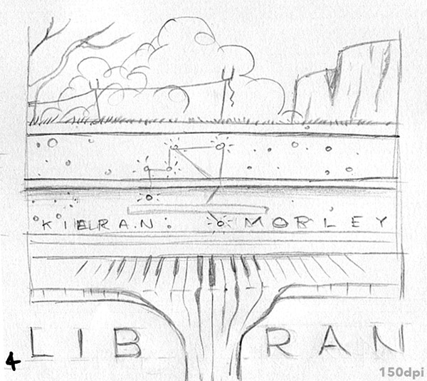
Kieran pitched in a nice idea after seeing how I’d put in a telegraph or power cable, suspended on those Dali like forks and connected it to the moon. He suggested that the cable be connected to the piano. I love that: Is the piano—and Kieran’s music powering the moon, or is it the other way around?
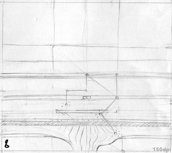
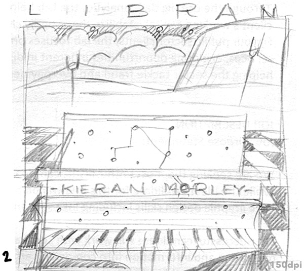
The name of the track ‘Libran’ made a visual connection for me—his wife is a Libran, she encouraged his creative exploits all the way, and he’s dedicating the EP to her—and I thought it’d be great to put the Libra constellation into the composition—along with a sprinkling of stars on the piano. As astronaut Bowman gasps in 2001: “My God… it’s full of stars!” I then thought that LIBRAN would be a great title for the EP, so I worked it into the sketches: et voila—it became the title.
I created and hand-brushed the typography, with a little Art Nouveau influence. Kieran and I both like that period of Parisian music and art, sharing a love of Claude Debussy’s music. It’s funny that even though Dali and Surrealism aren’t top of my list in art by any means, when I was last at Tate Modern art museum in London, I found the Surrealism section to be the most fun. Just pure fun.
I loved working on this, and Kieran’s delighted with the outcome. It’ll also be used on concert posters.
Progress/Process Images
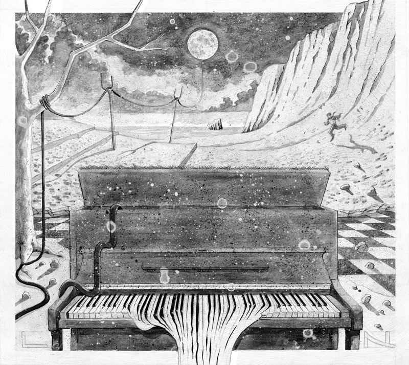
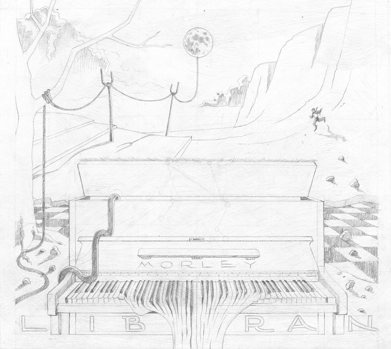
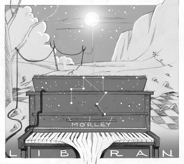
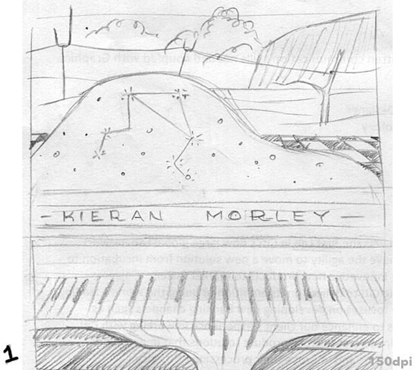


Illustrator: John White
Painting: Goauche, ink, pencil, on board
Colouring: Photoshop
